I haven’t been to a movie theater in over two years, but one memory I have from being in there is that sometimes they’d have posters of movies that weren’t yet in the previews. So, seeing posters could potentially be my first view at a new movie, which was exciting. I didn’t think too much about it artistically, it was more about the information.
Nowadays, each movie probably has two or three versions of the poster, so they’re less sacred, but I’ve come to really appreciate how cool some older movie posters look. So, naturally, I had to rank them.
For this list, I’m only looking at the original posters; not any of the variants. Let’s dive into an under appreciated aspect of the movies.
10). Fargo (1996)
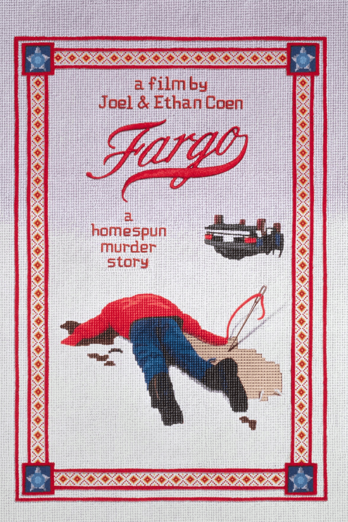
It’s a very appropriate design, a nice homespun knit depicting the crime in the middle of the snow. Also worth noting, I’m a sucker for real-looking images that are animated. I used to read Sports Illustrated for Kids and I loved the animated pictures of athletes. This looks like a well-done animation. Also more than any other poster, this has texture, which is a distinguishing factor.
9). Reservoir Dogs (1992)
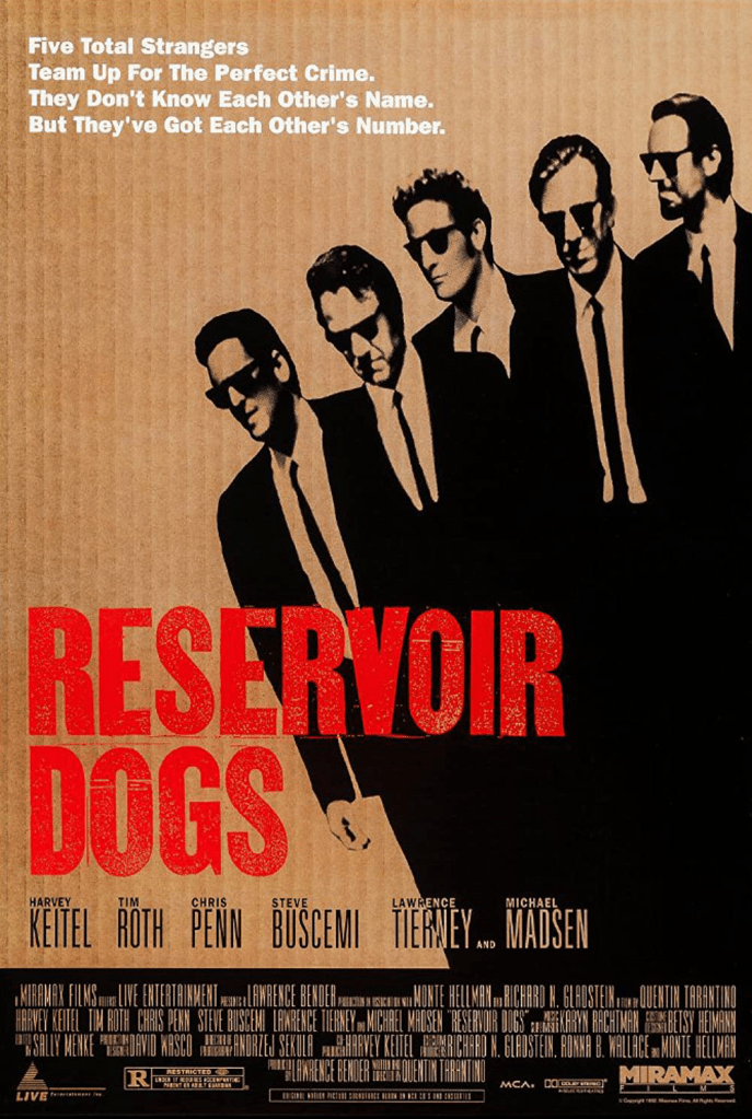
Tarantino’s first feature film has been moving up my list in general; it’s a terrific movie. One thing that’s awesome about it is that it’s just…cool. These guys are wearing suits and shades and they’re all very self-assured.
The poster captures the early scene where they leave the diner together on their way to the heist. They almost look like the Rat Pack. Just strolling with purpose. Suits and shades. It’s just a cool image. This is probably the case for all of these, but for this poster in particular, my affection for it is due in part to the fact that the movie backs it up. The characters are cool. The movie is really good. If this were a stinker, I doubt the poster would make the list.
8). Moonlight (2016)
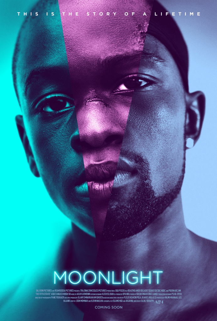
There are a few reasons I love this poster. For one thing, it’s a beautiful image. The color and the faces are really aesthetically pleasing to me.
Secondly, the three faces design is very cohesive with the movie. It isn’t just a cool or interesting image. The story is about a guy named Chiron, and it’s told in three chapters, so we’re with Chiron at three different points in his life while he sorts out his identity and his sexuality. The three faces are the three actors who play Chiron at different points in the movie. But rather than show the three of them standing next to each other, they’re split across the same face, since they’re all playing the same character at a different point in his life.
Also, the color, and its association to the story. This movie was based on the play, In Moonlight Black Boys Look Blue. The poster shows us this phenomenon.
The poster, in addition to just being beautiful, actually ties in to the movie.
7). Jurassic Park (1993)
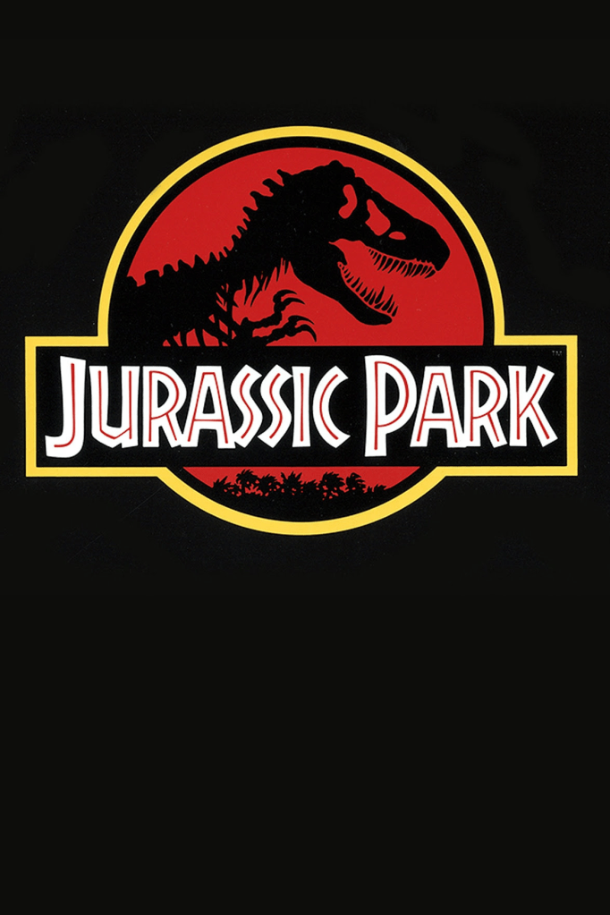
I’m not even a die hard Jurassic Park fan, but I just love the simplicity here. It’s mostly black with a dinosaur skeleton and the font from the movie. The color palette is nice and simple. It’s just very straightforward and clean. Aesthetically appealing.
6). Alien (1979)

Alien is the scariest movie that I’ve ever seen. It creates an air of existential dread that is heavier than any other movie I can recall. This poster shows a few of the elements that make it scary without spoiling what the titular alien looks like.
First off, we have those pods at the bottom. They’re creepy as hell in the movie. If you hadn’t seen the movie already, would they be as creepy? Maybe not, but I don’t like the look of them. That’s why they were creepy in the movie. They’re just ominous.
Then the egg. Obviously, someone who hasn’t seen it could piece together that it’s an alien egg. Once you’ve seen the movie, that egg takes on new meaning.
Also the tagline, “In space, no one can hear you scream”, is very clever. It’s effective without being over the top since it references a scientific aspect of space that most people either didn’t know or never thought about. The obvious route would’ve been something more like the ferocity of the alien or a more direct statement about how the crew is in trouble, etc. But this tagline is like a backhanded way of saying they’re in for some stuff.
5). Vertigo (1958)
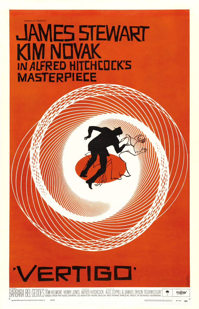
The spiral. The hypnotic symbol for the entire movie. Though it’s shown a ton in the opening credits and at various points in the movie, this is technically the first exposure to this perfect symbol for the emotional experience (and the vertigo).
As noted earlier, I enjoy the animated look here. Most posters feature real images so the animation is a nice point of distinction.
Orange is a nice color, and feels appropriate for this movie.
As noted earlier, if the movie wasn’t great, maybe I wouldn’t care about this poster. But, it is great, so, the poster is a visually pleasing interpretation of the movie.
4). The Usual Suspects (1995)

The lineup is just such an enduring image from the movie and from 90’s movies. It’s awesome that they captured it here. It happens relatively early, but it’s arguably the best scene in the movie and also what kicks off the main plot.
Probably similar to Reservoir Dogs, they just look kind of cool. If this were a zany comedy, the poster wouldn’t be as awesome, but it’s just the best possible image they could extract from one of the all-time great crime mystery movies.
3). The Thing (1982)
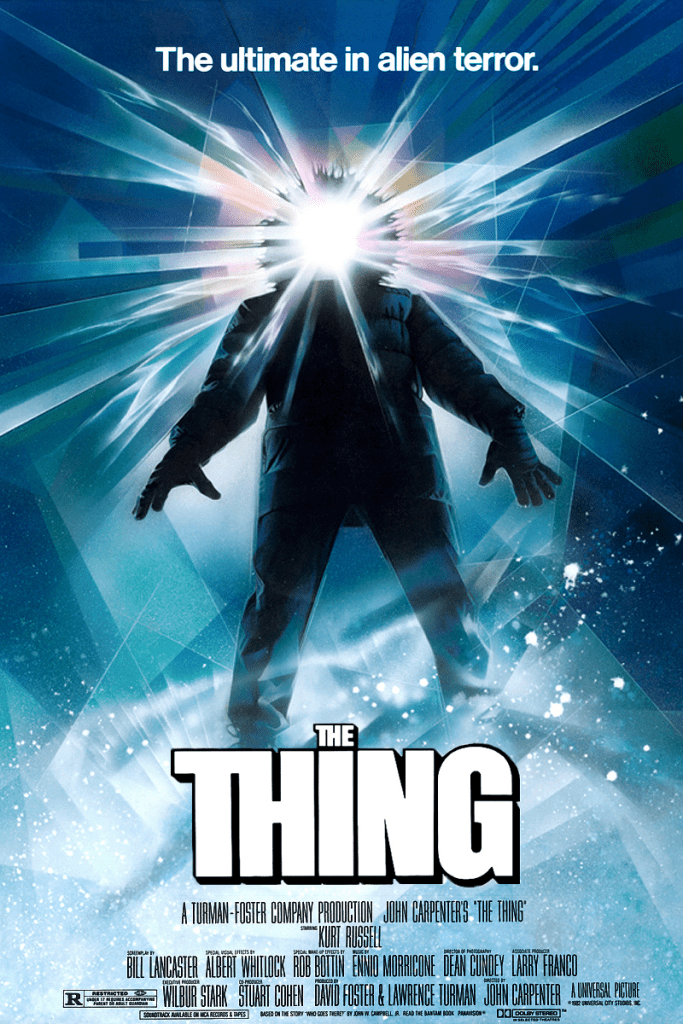
This movie is a personal favorite of mine, so that helps a lot, but I think this is an awesome poster. For one thing, it just looks cool. Many appealing blue colors and the shapes. However, what seals it for me, similar to some other animated posters, is that it’s an awesome artistic expression of the movie.
The Thing is one of the most atmospheric movies I’ve ever seen, and by that I mean that the actual setting, in this case, the frigid Antarctic research outpost, is palpable to the viewer. The figure on the poster is exactly what these guys look like; so bundled up that they’re only identifiable by the face. Only the face on the poster is a bright light, almost like it’s in the process of changing. Or just that it’s symbolic of the fact that it doesn’t matter who the person is because they’re no longer a person. Whatever it is, it’s a beautiful and interesting representation of the movie.
2). Halloween (1978)
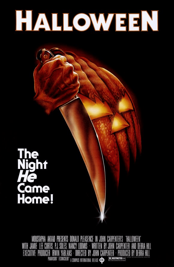
Another personal favorite movie. The poster is relatively simple. The creepy looking jack o’lantern. I love the strong-looking hand clutching the massive knife. It’s so threatening and certainly appropriate. Also, the tagline, “The night he came home!” Again, not a direct or obvious way to phrase it, but really paints a picture of what a force of nature Michael Myers is.
1). Jaws (1975)
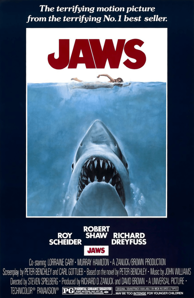
As I’ve said before, I’m not even the biggest Jaws fan; I like it, but it isn’t a seminal movie that I love. But how can you not love this poster?
It’s also very simple, but it hits on exactly the same nerve that made the movie so successful. We’ve all been in the water where we couldn’t see what was beneath us. Our imagination can run wild at what lurks underneath. What would be the worst possible scenario? It’s on the poster…
Honorable mentions: The Shawshank Redemption, Chinatown, Memento, Inside Out, Apocalypse Now, The Silence of the Lambs, Pulp Fiction, Scream, The Wild Bunch, Zodiac, Little Miss Sunshine, The Dark Knight Rises, Sunset Blvd, Dial M for Murder, 12 Angry Men, Rocky
